A complete guide to Flexbox — Part 1
Container properties, axis terminology, and the mental model that makes Flexbox click. Part one of a two-part reference for building responsive one-dimensional layouts.
Flexbox is the layout mode you reach for when items need to flow along one axis — a nav bar, a card row, a form row — and still adapt when the viewport shrinks. It replaces the float-and-clear hacks of the past with a container/item model that’s predictable once you learn the vocabulary.
This is part one of a two-part guide. Here we cover container properties — everything you set on the element with display: flex. Part 2 covers item properties.
Flexbox vs Grid
Both are layout systems, but they solve different problems.
Flexbox handles one-dimensional flow. Items move along a single main axis (horizontal or vertical), and the container decides how leftover space is distributed. Ideal for toolbars, tag lists, and any layout where content size drives the arrangement.
Grid handles two dimensions at once — rows and columns with explicit track sizing. Reach for Grid when you’re building page-level structure: dashboards, galleries, editorial layouts.
Flexbox distributes space inside a row. Grid defines the row itself.
Most real pages use both: Grid for the page skeleton, Flexbox inside each region.
Terminology
Flex items are laid out along two axes:
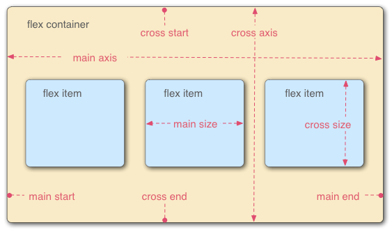
- Main axis — the direction items flow (
row= horizontal,column= vertical). Ends are main start and main end. - Cross axis — perpendicular to the main axis. Ends are cross start and cross end.
- Flex container — the parent with
display: flex. - Flex items — direct children of the container.
Keep this vocabulary handy — every property below references main or cross.
Direct children only. display: flex affects immediate children. Nested elements are untouched unless their own parent is also a flex container.
Playground
Reading about Flexbox is fine. Tweaking properties and watching the layout shift is better. I built an interactive Flexbox playground for exactly that — use it alongside this guide to see each property in action.
Container properties
These go on the element with display: flex.
display
Enables flex formatting context for direct children.
.container {
display: flex;
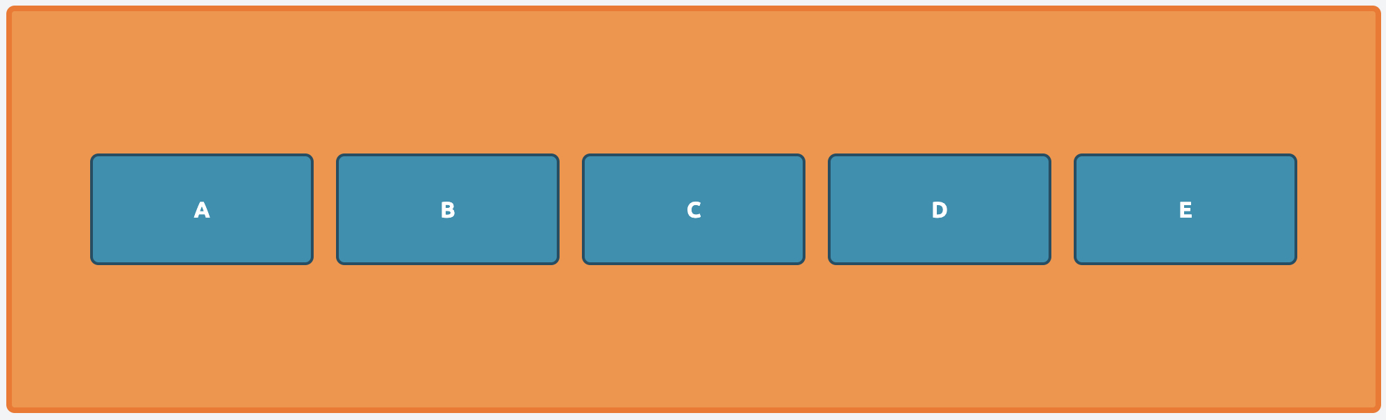
}flex-direction
Sets the main axis direction and item order.
.container {
  display: flex;
  flex-direction: row; // default
}
.container {
  display: flex;
  flex-direction: column;
}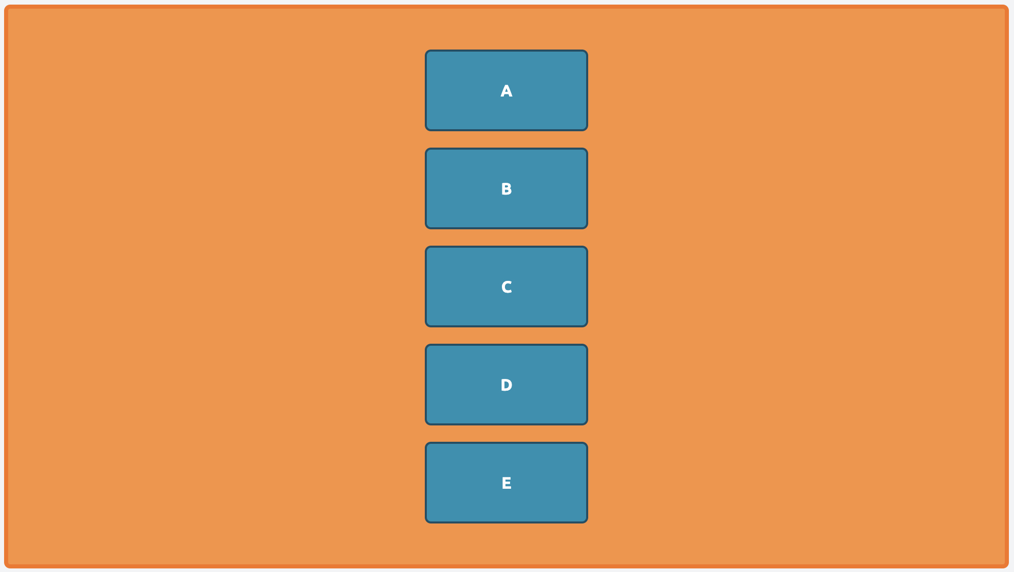
Values: row (default) · row-reverse · column · column-reverse
flex-wrap
Controls whether items stay on one line or wrap.
.container {
  display: flex;
  flex-wrap: wrap;
}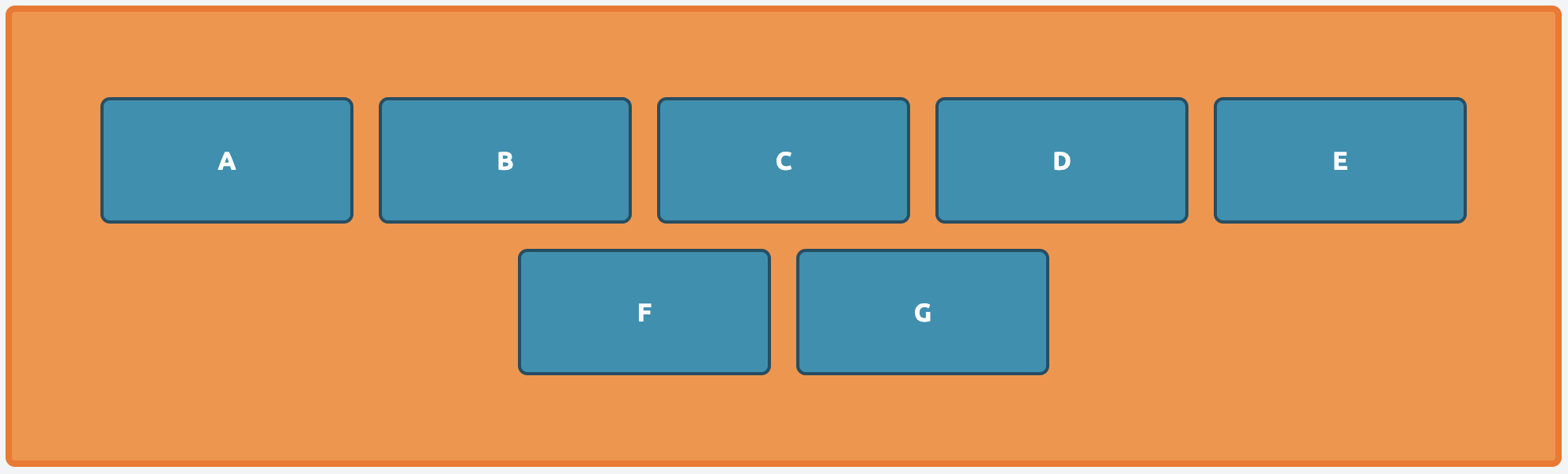
Values: nowrap (default) · wrap · wrap-reverse
flex-flow
Shorthand for flex-direction and flex-wrap.
.container {
  display: flex;
  flex-flow: row wrap; // [flex-direction] [flex-wrap]
}
justify-content
Aligns items along the main axis.
.container {
  display: flex;
  justify-content: space-between;
}
Values: flex-start (default) · flex-end · center · space-between · space-around · space-evenly
align-items
Aligns items along the cross axis (per item, single line).
.container {
  display: flex;
  align-items: center;
}
Values: stretch (default) · flex-start · flex-end · center · baseline
align-content
Distributes lines along the cross axis when items wrap and extra space remains.
.container {
  display: flex;
  flex-wrap: wrap;
  align-content: flex-end;
}
Values: stretch (default) · flex-start · flex-end · center · space-between · space-around · space-evenly
align-items vs align-content. align-items aligns items within a single line. align-content only matters when you have multiple wrapped lines.
place-content
Shorthand for align-content and justify-content.
.container {
  display: flex;
  place-content: center flex-start; // [align-content] [justify-content]
}
gap, row-gap, column-gap
Control spacing between flex items (and wrapped lines).
.container {
  display: flex;
  gap: 10px 20px; // [row-gap] [column-gap]
}
A single value sets both axes. Default is 0.
What’s next
That covers every container property. In Part 2 we move to the items themselves — flex-grow, flex-shrink, flex-basis, order, and align-self — where most layout bugs actually hide.